Logo and Seal
Wake Forest University logo
The Wake Forest University logo is the most visible and recognizable element of our brand identity. Our logo includes a contemporary version of the Wake Forest shield, the icon that appears in the University seal and as a wrought iron architectural detail throughout the campus. Below the shield is a typographical treatment of our name that reflects our strength and stature. Within the shield, arching treelike branches suggest growth, collaboration and outreach. The lines converge at the center of the shield to form a subtle, stylized “W.” The division of the shield into two halves alludes to the duality of each element of our mission: We serve both an academic and moral cause; we are as devoted to humanity as we are to the pursuit of knowledge; and we develop the conscience as well as the mind.

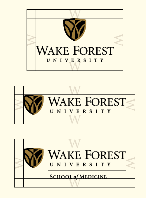
There are two versions of our logo. The vertical version has the shield above the text, and the horizontal one places the shield beside the text. Choose the version that fits the space the best. The vertical version works best when it can be centered and floated in a generous margin of space, such as on the cover of a formal communication. The horizontal logo works well in tight horizontal spaces, such as in online banners and other applications with limited depth.
In general, the vertical version is more traditional in style; the horizontal version is more contemporary.
The Wake Forest University signature and the interlocking “W” shield are registered trademarks of Wake Forest University.
For permission to use the marks on merchandise and apparel, email licensing@wfu.edu.
The shield

As a recognizable symbol of the University, the shield may be used alone without the “Wake Forest University” type. However, it should be supported by the full logo whenever possible. On multi-page pieces, for example, the full logo should be used on the back. In more limited spaces (e.g., single-page flyers), Wake Forest University should be referenced in the text. For items such as stickers, flash drives and other materials with a limited imprint area, the shield alone will suffice. The shield should never be used as a pattern or in combination with another symbol to create a new logo. If you have questions about whether your application is acceptable, please contact University Marketing and Communications at identity@wfu.edu.
School logos
Each school within the University has its own logo lockup in both a vertical and horizontal version. In these logos, the school name falls below a thin line underneath the Wake Forest logo. These logos appear on all stationery materials for the graduate schools.
For less formal communications, a shortened version of each school logo was created (e.g., Wake Forest Business instead of School of Business/Wake Forest University). These simplified school logos should be used sparingly and when space is limited. The primary school logo should always be used on digital and print materials related to academic ceremonies.
For the School of Medicine logo, contact Creative Communications at Wake Forest Baptist Health.
Do not attempt to re-create a logo.
Department descriptors
The Wake Forest University logo may include a department descriptor if the department is a university-wide or administrative department or if the department spans undergraduate and graduate schools. School logos may also include a department descriptor. Logos with department descriptors must be approved and provided by University Marketing and Communications (Reynolda Campus) or Creative Communications (Medical Campus). Adding a department descriptor independently or designing your own departmental logo is not permitted.
Area of isolation
The legibility and distinction of our university logo are very important. To ensure that the logo is highly visible, always separate it from its surroundings. The area of isolation, or clear space, surrounding the logo should equal the height of the “W” in “Wake Forest.” Do not allow any other graphic element to penetrate this area of isolation.
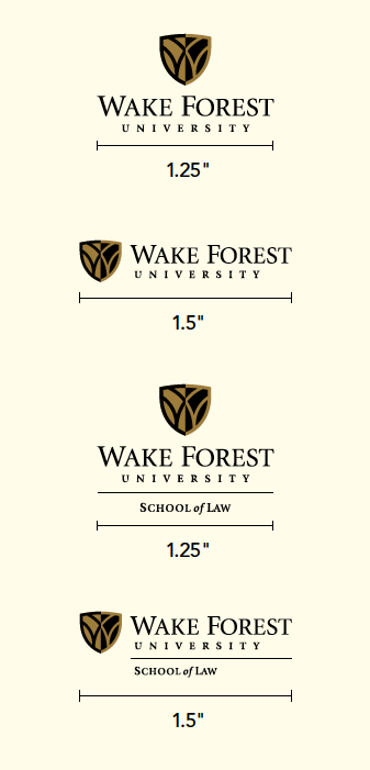
Minimum size
There is a minimum size for reproducing any Wake Forest University logo. The minimum size limit ensures that our logo remains legible and applies to any print or online usage. Never reproduce the logo smaller than the minimum size.
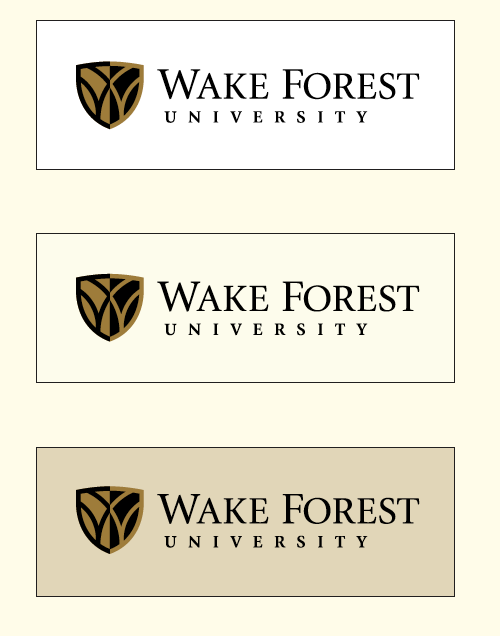
Logo color versions
The logos shown are the permissible color versions of the Wake Forest University logo. Whenever possible, use a version of the logo that includes both of our primary colors, Old Gold and black. This includes the full-color version on a white or neutral background, the Old Gold version on black or the black version on Old Gold.
When printing restrictions do not permit the use of both primary colors, use the black one-color logo on a white or neutral background or the white logo reversed out of black. On black backgrounds, it is preferable to reverse out the Wake Forest Gold logo. If two colors are not available, the logo may be reversed out in white. Any time the logo is reproduced in one color, the left side of the shield should be solid.


Full-color logo usage
The full-color logo should only be used on a background light enough to provide contrast.
One-color logo usage
In any situation where the full-color logo is not possible, use the one-color logo in gold, black or white, whichever provides sufficient contrast.
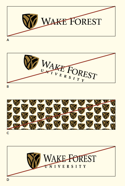
Incorrect logo usage
The examples shown represent incorrect usage of the Wake Forest University logo.
A | Do not use part of the logo, such as “Wake Forest” without “University.”
B | Do not angle or rotate the logo.
C | Do not use the logo as a pattern.
D | Do not stretch, distort or alter the logo in any way.
E | Do not use a different typeface in the logo.
F | Do not use the Wake Forest University logotype without the symbol.
G | Do not use centered type with the horizontal logo.
H | Do not substitute “University” in the logo with any name or descriptor.

Single-line horizontal logo
Primarily designed to be a web header, the single-line horizontal logo may be used for applications where there is insufficient vertical space.
Logo Dimensions: 300 x 36 pixels (Do not use at a larger size.)
Special applications
Certain applications may require a specialized version of the logo — embroidery, for example. Please contact University Marketing and Communications at identity@wfu.edu for assistance in these cases.
Co-branding
When using the Wake Forest University logo with another logo, such as for a co-sponsored event, observe the area of isolation for the Wake Forest logo and center a .25″ rule between the two logos. The logos may appear side by side or stacked, depending on space restrictions. Use only the horizontal version of the Wake Forest logo.

Athletics logos
Wake Forest University Athletics logos may be used for communications related to athletic events. Both the bold block WF and the Demon Deacon are official athletics logos. These logos are for use only with materials related to athletic events. For all other communications, use the Wake Forest logo. For graphic standards and information about the Wake Forest Athletics logos, visit the Athletics Logo & Branding page.

Atrium Health Wake Forest Baptist Medical Center
Atrium Health Wake Forest Baptist Medical Center is a separate entity from Wake Forest University and uses a separate logo. Do not use the Wake Forest University logo for any communication prepared for the medical center. For graphic standards and information about the Atrium Health Wake Forest Baptist Medical Center, contact Atrium Health Wake Forest Baptist Creative Communications.
Wake Forest University seal

The Wake Forest University seal, designed in 1908 by William Louis Poteat and his predecessor, Charles E. Taylor, represents the rich heritage and history of our University. Inscribed with the words Pro Humanitate, it is a classic icon symbolizing our University’s vision to serve mankind through the pursuit of knowledge. The seal is used primarily for official documents and occasions. In rare cases, it can be employed in strategic communications or University-wide initiatives if sanctioned by the President’s Office. The seal must not be used as a casual logo or identity, a design element in recruitment materials or a decorative element. Ideally, the seal should be reproduced in Wake Forest Gold, either on an approved neutral background color or on black. The seal may also be embossed, foil-stamped or used as a watermark.
Uses for the seal include:
- Official legal documents
- Transcripts
- Convocation and Commencement documents
- Honor society documents
- The official catalog
- Diplomas
- Board of Trustee resolutions
- Presidential communications
- University stationery watermark
The seal illustrations shown here are examples only and are not intended or authorized for any use.
To request prepared digital art of the Wake Forest University seal, please contact us at identity@wfu.edu.
Sub-brands for Centers and Institutes
UMC creates sub-brands and custom logos for Provost-sponsored centers and institutes on a case-by-case basis. These brand identities are intentionally unique in relation to the University logo because the center, institute or time-critical initiatives and programs merit significant recognition in a marketplace beyond Wake Forest. Sub-brands also provide visual leverage when centers and institutes compete with comparable commercial entities.
Sub-brands benefit from and elevate the broader Wake Forest brand. In all digital or print applications for external audiences, custom sub-brand logos should be paired with the words “Wake Forest University” and/or the Wake Forest logo to amplify brand and sub-brand recognition.
Wake Foresters across all divisions are enthusiastic about our work, and it is tempting to want a special look for every Wake Forest entity. But our institution as a whole is best served by a consistent brand framework and disciplined use of logos.